

Motion Graphics: Make the Complex Simple
By Matthew Stanton | August 20, 2026
Motion graphics exist for the ideas you can’t point a camera at. A product is easy to film. So is a person, a room, an event. But a process has no face. A system has no location. A service that lives entirely inside software has nothing you can walk up to and shoot. When there’s nothing to show, most videos fall back on explaining, and that’s usually where they lose the room.
Some Things Just Can’t Be Filmed
Every project starts with a practical question. What are we pointing the camera at?
Plenty of the time the answer is obvious. A venue, a keynote, a product coming off a line, a person telling a story they’ve lived. Those film themselves.
The trouble starts with the abstract. A workflow. A compliance requirement. A set of survey results. A piece of software that only exists on a screen. You can film the people who built the thing and the building they built the thing in, but neither one actually shows the thing.
So the video talks about it instead. A voice describes the process. A subject explains the benefit. Words appear on screen. It’s accurate, it’s professional, but it bounces off the viewer, because they were promised they’d see something and they’re being told about it instead.
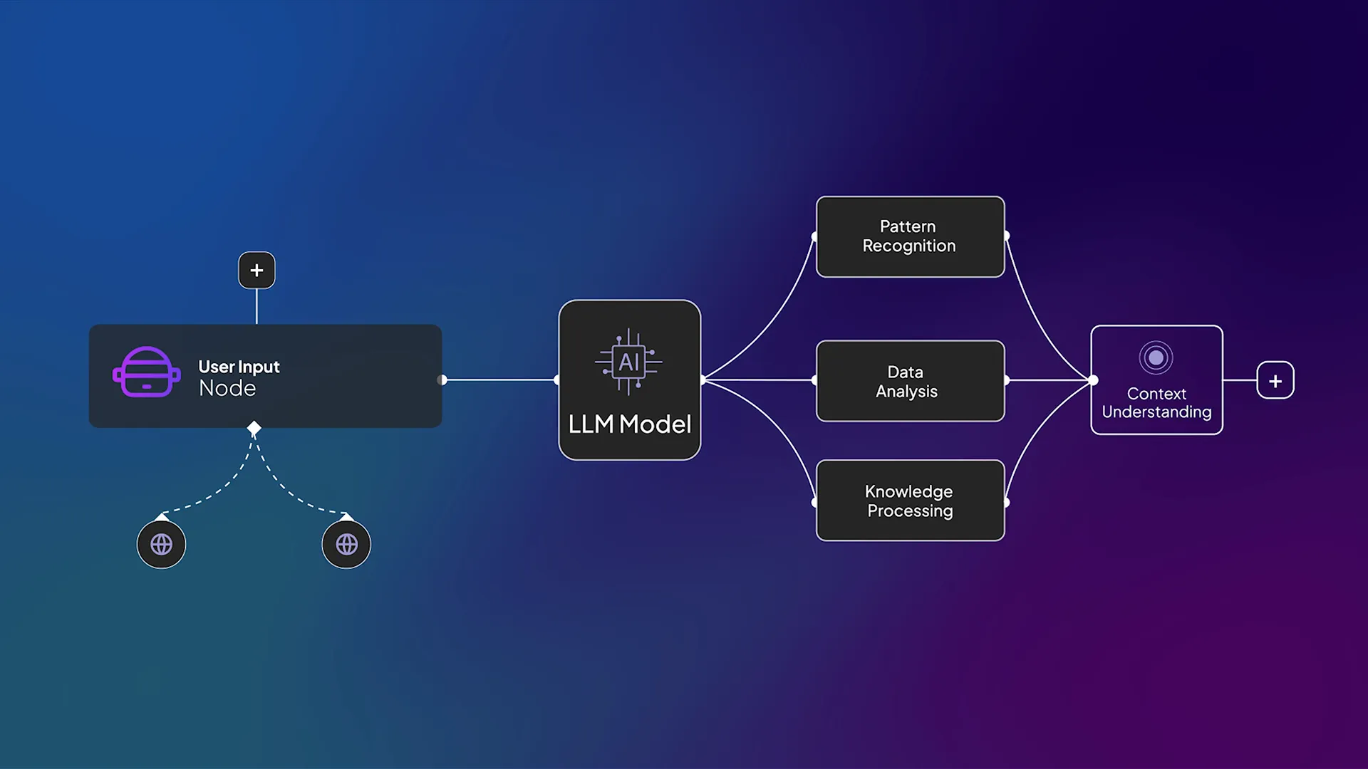
A question going into an AI model and an answer coming out. Every step in the middle is real, and none of it has a physical form you could photograph.
What Motion Graphics Actually Do
Motion graphics close that gap by giving the abstract a shape.
A number counts up, so you feel its size instead of reading it. A bar grows beside another bar and the comparison lands before the narrator finishes the sentence. A diagram assembles one piece at a time, in the order the process actually happens, so the structure gets absorbed rather than memorized.
That last one is the part people underestimate. In a static chart, everything arrives at once and the viewer has to work out what to look at first. In a built sequence, the order is the explanation. You’re not just showing the information, you’re showing the shape and flow of it, and those are usually difficult to verbalize.
A National Survey, 1,000 Responses, and No Footage
Here’s a real example.
The American Bar Association runs an annual Survey of Civic Literacy, and See It Media has produced the webinar and the highlights video for it since 2021. The 2024 edition landed in an election year and asked 1,000 Americans what they thought about democracy and voting.
The findings had weight. Nearly three quarters of respondents, 74%, said American democracy was weaker than it had been five years earlier. Asked why, 31% pointed at misinformation and disinformation and 29% pointed at political parties. More than half said they were worried about the integrity of the coming election.
As a report, that’s a strong document. As a video, it’s a wall. A survey has no location, no protagonist, and nothing happening in front of a lens. The default version of this video is a narrator reading percentages over stock footage of a polling place, and by the fourth number nobody is retaining any of them.
So we built it differently. The piece opens with real clips of the misinformation people were describing, pulled straight off social media, so the problem arrives in the viewer’s own feed before anyone explains it. From there the graphics carry the argument. Each finding gets constructed on screen as the voiceover reaches it. Percentages assemble. Categories separate out so you can see how the responses split.
Take one example. The survey asked about specific election measures, and support ran high across every one of them. 80% backed voter ID requirements, 74% supported restoring the vote to people who had completed a felony sentence, 73% backed early voting, and 71% backed absentee voting. Read aloud, that’s four numbers in about eleven seconds, and none of them stick.
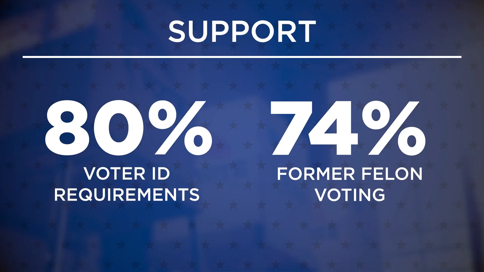
A frame from the ABA highlights video. Two of the findings, built on screen and held there while the voiceover talks about them.
With the statistics visualized, nobody has to struggle to retain them in their head. Each one is visible while it’s being discussed, and then they make room for the next.
Why Clarity Earns Trust
There’s a reason this works beyond it simply being nicer to look at.
Researchers call it processing fluency, and the finding is blunt. Information that is easier to process gets judged more likely to be true. Norbert Schwarz, who has spent much of his career on this, puts it in exactly those terms in his review of the research. Information that is easy to process is judged to be true.
That’s slightly unnerving to know. It means the presentation is doing the work that we’d like to believe only evidence does. However, it also explains something every producer has watched happen in a room. When people follow an idea easily, they lean toward it. When they struggle to understand it, they hold back, and that hesitation attaches to the message rather than to the effort of following it.
So clarity isn’t decoration on top of a good argument. It’s part of whether the argument gets believed at all.
Restraint Is the Whole Craft
Motion graphics go wrong when they start showing off.
Nielsen Norman Group says animation should be unobtrusive, brief, and subtle, and that too much of it distracts people instead of helping them. That’s written about websites, but it’s just as true in a video. Every movement should be doing a job. If a number flies in from the left because flying in looks cool, it’s fighting the narrator for attention.
So we use a simple test. Take the movement away. Did anything get lost? If nothing did, it shouldn’t have been there in the first place.
The moves that pass that test are almost always the plain ones. A number counting up. A group splitting apart. One item staying put while everything around it moves.
When Motion Graphics Are Worth It
Not every video needs them. Some do. Here are examples when they could be useful:
- Research, survey data, or any finding that arrives as a page of numbers
- A process with steps, especially one where the order is the point
- A service that lives inside software, where the real product is a screen
- Comparisons, before and after, or anything where scale is the argument
- Any subject where the alternative is a person on camera describing something the audience cannot see
In contrast, if the subject is genuinely photogenic, film it. A motion graphic that stands in for footage you could have shot is a missed opportunity, not a technique.
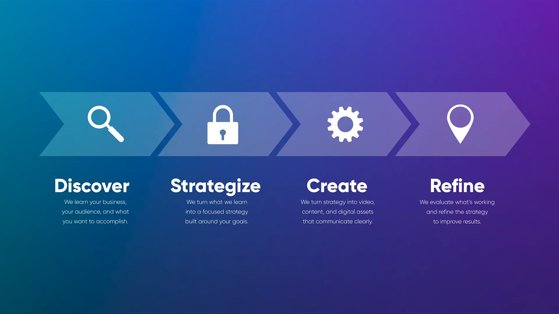
Our own process, drawn as a sequence rather than described as one. The order is the information.
The Takeaway
Complexity isn’t the problem. Invisible complexity is. The moment an idea or concept is visualized on screen, an audience stops working to understand and starts following along, and that’s the point where they begin to trust what they’re hearing.
If your service is complex, your video shouldn’t be. See It Media builds motion graphics and custom animation as part of full video production, and we’ve done it for national organizations and small brands alike. Contact us and let’s make your message easier to see.


FAQs About Motion Graphics
Q: What are motion graphics?
Motion graphics are animated visual elements built to carry information rather than to decorate. Text, numbers, charts, diagrams, icons, and shapes that move with purpose. They’re most often used for the parts of a story that can’t be filmed, like a process, a data set, or a service that only exists on a screen.
Q: When should a video use motion graphics instead of footage?
When the subject has no picture. If you can point a camera at it, film it. If the subject is a workflow, a statistic, a comparison, or an idea, footage will only get you a person describing it. Motion graphics let the audience see the thing itself rather than watch someone talk about it.
Q: Can motion graphics be added to a video we already have?
Often, yes. Lower thirds, callouts, animated statistics, and diagram sequences can be built over existing footage, and it’s a common way to rescue a video that’s accurate but hard to follow. How well it works depends on how the original was shot and edited, so it’s worth a look before anyone commits.
Q: How long does a motion graphics video take?
It depends far more on the content than on the animation. Once the script and the data are settled and the visual direction is approved, the build moves quickly. What sets the pace is deciding what the piece is trying to communicate, because every graphic is a decision about what matters most in the information.
Q: Do motion graphics help people remember information?
They help people follow it, which is the step before remembering. Building a figure on screen while it’s being discussed means the audience isn’t holding numbers in their head while the narration moves on. Research on processing fluency also finds that information which is easier to process is judged more credible, so clarity affects belief as well as recall.
Recent Posts

Social Media Video: The False Reality of the Influencer Reel
Social Media Video: The False Reality of the Influencer Reel
Custom Website Design: Great Sites Are Never Accidents
Custom Website Design: Great Sites Are Never Accidents

AI for Your Brand: Make It Sound Like You, Not Everyone Else
AI for Your Brand: Make It Sound Like You, Not Everyone Else
